

Pantone Color Institute is the business unit within Pantone that highlights the top seasonal colors of the market, presents to the public the color color of the year, predeads the global color trends and advises the companies on the product and the visual identity of the brand. Through the forecasts of seasonal trends, color psychology and consulting, Pantone Color Institute collaborates with global brands to effectively use the power, psychology and emotion of color in their design strategy.
For over 20 years, the color of the year designated by Pantone has influenced the development of products and purchase decisions in several industries, including fashion, house furniture and industrial design, as well as product packaging and graphic design.
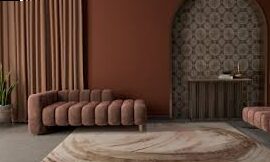
The pantone selection process of the color of the year requires a careful analysis of the trends. The color experts from Pantone Color Institute are in detail the current trends to discover new shades. The attention of the specialists is targeted on the entertainment and films industry, art collections, new artists, fashion, all design areas, popular travel destinations, as well as new lifestyle and socio-economic conditions. Influences can also come from new technologies, materials, textures and effects that have impact on colors, relevant social networks and even future sports events that capture worldwide attention.
What are the colors of 2022?
If you are in the process of arrangement and you are not determined in terms of bedroom colors or the right colors for the kitchen, now you can consider the pantone shades into trends that will turn your home into a dream space. Pantone Color Institute did not delay the color announcement of 2022, and the winners was Pantone 17-3938 Very Peri. According to the specialists, the color very peri is inspired by the digital design that helps us to expand the limits of reality, opening the door to a dynamic virtual world in which we can explore and create new color possibilities. With gaming trends, the expansion of metro and the growing artistic community in the digital space, Pantone 17-3938 Vey Peri illustrates the merger of modern life and how the color trends in the digital world manifest themselves in the physical world and vice versa.
Because it is very important to be in trend this year, I made a selection of Canvas paintings in which the Very Peri shade predominates, suitable for the kitchen, bedroom and living:
Other pantone colors in trends in 2022 are:
- Blue, such as Pantone 17-4540 Hawaiian Ocean
- Orange, respectively pantone 15-1264 turmeric
- Pink, for example Pantone 16-1640 Sugar Coral
- Green such as Pantone 14-0340 Lime Acid
We hope that this article has inspired you and will help you choose the colors so that it is in the new trends. We are extremely curious to find out what will be the color of Pantone 2023 and we will definitely share with you!
Conclusion
Color plays a vital role in the way people perceive and interact with the world around them. The Pantone Color Institute understands this deeply and has positioned itself as a global authority in guiding how color influences design, emotion, and branding. By analyzing cultural, social, and psychological trends, the Institute not only predicts the colors that will define upcoming seasons but also helps brands and designers use color as a strategic tool.
Each year, the Pantone Color Institute introduces the “Color of the Year,” which has become a cultural reference point in fashion, interior design, technology, and marketing. This initiative demonstrates how color can symbolize broader emotional currents and societal shifts. The selected color becomes more than just a visual preference—it becomes a statement, a direction, and often, a reflection of global mood and values.
Beyond annual highlights, the Institute also provides personalized consulting to companies looking to shape or refresh their visual identity. Their expertise in color psychology allows them to suggest hues that resonate with target audiences, evoke the desired emotions, and enhance brand recognition. Through their close collaboration with designers, product developers, and marketing experts, they help brands tell compelling stories—visually.
In conclusion, the Pantone Color Institute stands as a global authority in shaping how color is perceived, applied, and experienced across industries. By combining in-depth research, seasonal forecasts, and psychological insights, Pantone provides invaluable guidance for brands seeking to strengthen their identity and connection with audiences. Its work transcends simple aesthetics; it integrates the emotional and psychological impact of color into strategic design choices that influence consumer behavior and market trends.
The announcement of the “Color of the Year,” along with seasonal palettes, does more than showcase attractive hues—it establishes a common language that inspires creativity, innovation, and cultural conversation worldwide. Businesses in fashion, design, technology, and marketing often rely on these insights to remain relevant and aligned with consumer expectations. This influence highlights the Institute’s role not only as a trend forecaster but also as a driver of cultural narratives where color becomes a symbol of values, moods, and aspirations.
Moreover, the Pantone Color Institute emphasizes the importance of understanding color beyond its visual appeal. Through color psychology, it demonstrates how shades can evoke emotions, shift perceptions, and even shape decision-making. This approach allows companies to position their products with greater emotional resonance, creating lasting impressions that go far beyond surface-level branding.
Ultimately, the Institute’s contribution extends to both creativity and commerce. It empowers brands to tell stories, connect with audiences, and innovate in ways that would not be possible without the thoughtful integration of color strategy. As markets grow more competitive and consumers more attentive, the insights provided by Pantone Color Institute ensure that color continues to be a powerful, strategic, and universal tool for influence and inspiration.
Latest Posts Published

The assets of the ironwork style for your gate

What elements influence the price of fuel oil?

Yucca with drooping, yellow, dry, brown leaves at the end or that loses its leaves: what to do?
How to choose tiles that you will not tire

Debout, kitchen and dining table

The advantages of combined electricity and gas offers

When and how to plant an avocado in a pot: maintenance, watering, exposure, repotting
5 ideas for arranging the basement of a house

How to choose a floor wash robot
